Creating an impactful promotional poster for a pay-per-view event is crucial for attracting viewers and keeping fans engaged. WWE has delivered some strong posters for Survivor Series over the years, but they’ve also produced some less impressive ones.
Survivor Series posters don’t always miss the mark completely, but sometimes the design choices and presentation can be puzzling, resulting in some notably weak promotional materials. Issues range from odd artwork, strange wrestler selections, to poor editing, which don’t always showcase the best of the event.
For example, the 2015 Survivor Series poster, marking The Undertaker’s 25th anniversary, was a simple image of him standing with a large “25” in the background. This poster, using an old photo from 20 years ago rather than a more recent or debut shot, felt lazy and uninspired, contributing little to boost interest despite The Undertaker participating in tag team action at the event.
The 1992 poster was technically below par and visually cluttered. It oddly promoted matches like Ric Flair & Razor Ramon vs. Randy Savage & Ultimate Warrior and a Nightstick match, while completely ignoring the main WWE Title match between Bret Hart and Shawn Michaels, which was baffling and misguided.
In 2001, WWE showcased Lita and Torrie Wilson on the poster to celebrate the Invasion storyline’s end, but featuring them over the star-packed main event roster was strange, especially since Torrie Wilson did not even compete at the event. The poster offered little excitement or context for what fans should expect.
The 2013 Survivor Series poster featuring the Wyatt Family lacked the eerie vibe their storyline suggested. Instead of capturing their creepy cult presence, the photo was bland and uninspired, undermining their portrayal and failing to create the spooky atmosphere needed.
For the 2020 event, the poster commemorated The Undertaker’s 30th anniversary in WWE, but as he only made a final appearance without wrestling, the focus on him felt misplaced. The poster was dull and did not reflect the overall card’s excitement.
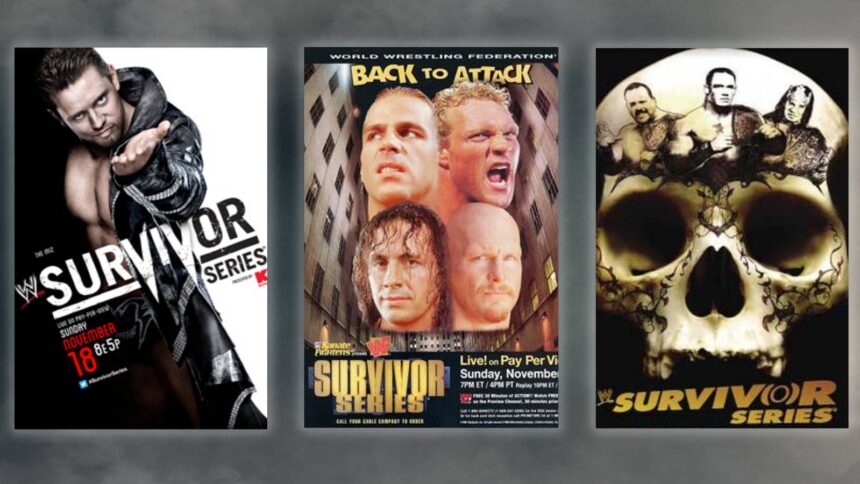
The 2006 poster, featuring John Cena, Big Show, and Booker T on a skull design, came off as awkward and poorly arranged. The images seemed oddly stretched and did not blend well in the design, making it one of the less memorable posters.
In 1996, the poster is often criticized for its rushed look, grouping the heads of Shawn Michaels, Psycho Sid, Steve Austin, and Bret Hart awkwardly, giving the impression their necks were connected, resulting in a cheap and unprofessional appearance.
The 2012 poster was considered the most uninspiring, with The Miz standing against a simple black-and-white background, contributing no energy or personality. It was confusing why WWE highlighted The Miz in this fashion, as he played a minor role on Mick Foley’s team that year.
Fan Take: For WWE fans, these posters are more than just promotional images—they shape the initial impression of the event and can heighten anticipation. Poorly designed posters may reflect missed opportunities in marketing, which can ultimately affect pay-per-view buys and the overall excitement around the sport.


